
The Client
Stockport Accountancy Services provides dedicated tax, bookkeeping, and payroll solutions to local sole traders, limited companies, and growing businesses. Looking to modernise their digital presence, they partnered with our studio to deliver high-converting web design for accountants in Stockport and the wider Greater Manchester area.
The Brief
The client needed a clean visual identity and a user-friendly website to position them as a modern, approachable alternative to traditional finance firms. The objective was clear: combine sharp Logo Design & Branding with professional websites for accountants that generate qualified local leads and streamline client enquiries.
The Outcome
By unifying their digital presence with tangible, local marketing collateral, Stockport Accountancy Services established instant visual authority. The new responsive platform acts as a reliable lead engine, while their cohesive print assets ensure every client handoff reinforces their professionalism.
Our Approach
Visual Authority & Brand Refresh
Financial services rely heavily on initial trust. We crafted a crisp visual identity engineered for clarity across digital screens, storefront signage, and printed corporate stationery.
High-Converting Web Architecture
As specialists in web design for accountants in Stockport, we structured the website layout around clear user journeys—making service pages easy to digest and contact forms simple to complete.
Seamless Physical & Digital Integration
We ensured their real-world brand matched their digital platform by delivering high-grade business cards, promotional leaflets, and display materials ready for local networking.
What we delivered
The Logo & Identity
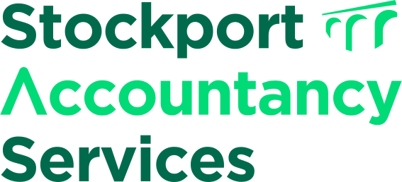
We designed a modern visual identity for Stockport Accountancy Services that balances corporate trust with local pride. We chose a dual-green colour palette, using deep forest green to signal financial stability and a vibrant mint accent to represent growth and modern energy.
The logo design features two key bespoke details. First, the letter ‘A’ in “Accountancy” is styled as an upward arrow to represent business expansion and positive yield. Second, the accompanying brand mark uses negative space to showcase the iconic arches of the Stockport Viaduct. This gives the firm an instantly recognisable, locally rooted identity across web and print.
Logo

Colours
Fonts
Aa
Web Design
The Stockport Accountancy Services website design project focused on delivering a slick, reliable platform that turns site traffic into active consultancies. Explore our core Web Design Solutions to see our complete process.
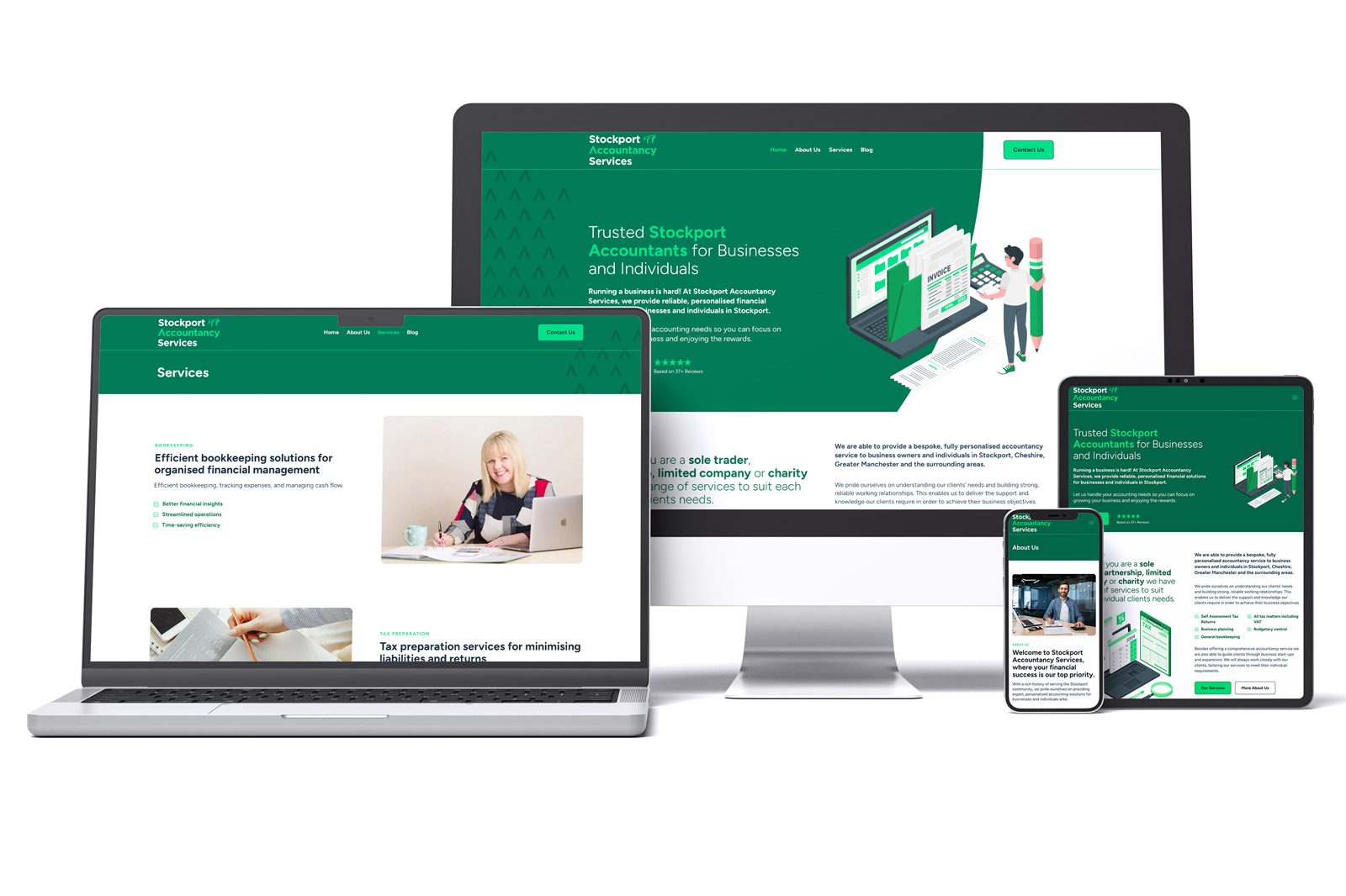
We engineered the new platform to turn local traffic into active client inquiries, delivering the high-performing web design for accountants in Stockport that modern firms need to compete online.
Graphic Design & Print
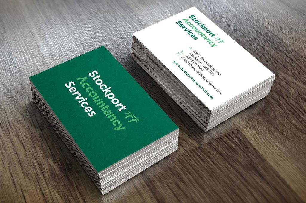
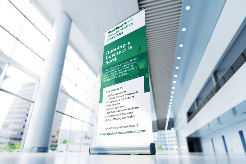
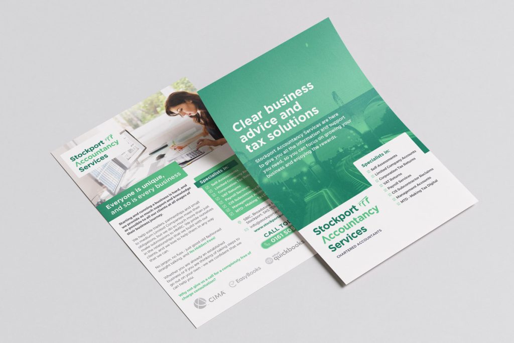
To support their local business outreach, we designed and printed a complete suite of physical marketing collateral. Discover our comprehensive Design for Print Services
to see available finishes.