

The Client
Manchester Lumps Clinic is run by Mr Amit Kumar, a Consultant Orthopaedic Surgeon at Manchester University Hospitals NHS Foundation Trust and Clinical Lead of Sarcoma for Greater Manchester. The clinic offers private assessment, diagnostics and management for patients with lumps — from common, benign conditions through to rarer soft tissue sarcomas.
The Challenge
Patients arriving on the site are often anxious, searching for answers about a lump they’ve found and unsure what happens next. The old site wasn’t giving them that reassurance, or giving Mr Kumar’s private practice the professional, trustworthy presence it needed to stand out and attract new patients.
The Goal
Patients arriving on the site are often anxious, searching for answers about a lump they’ve found and unsure what happens next. The old site wasn’t giving them that reassurance, or giving Mr Kumar’s private practice the professional, trustworthy presence it needed to stand out and attract new patients.
The Outcome
The result is a site that does two jobs at once: it educates and reassures patients who are often searching in a moment of real worry, and it positions Mr Kumar and Manchester Lumps Clinic as the credible, private specialist option in Manchester. The condition-by-condition structure also gives the clinic a page to rank for every type of lump-related search a prospective patient might make, not just the clinic’s name.
The site is now much more user-friendly, featuring multiple call-to-action buttons on the homepage and a streamlined navigation system on each of the common lumps pages.
As with all our websites, we implemented on-page SEO from the start. After the site went live, we further optimised it by incorporating focus keywords and detailed page descriptions, while also enhancing site tracking and improving its search engine rankings.
Our Approach
Structure First
Before any design work, we mapped out the conditions and services Mr Kumar treats into a clear page hierarchy: a parent “Common Lumps” page with individual condition pages beneath it, so patients (and search engines) can find exactly the condition they’re worried about.
Tone Over Templates
Medical sites can easily feel cold or overly clinical. We wrote and designed around a calmer, more human tone throughout, without losing the clinical authority Mr Kumar’s credentials bring.
Trust signals, built in
Rather than bolting reviews on as an afterthought, we integrated Doctify’s live rating widget so patient feedback is visible sitewide, not just on a testimonials page.
A clear next step, always.
Every page, whether it’s a condition page or the homepage, ends with the same low-friction options: face-to-face, video, or phone consultation.
What we delivered
The Logo & Identity
Alongside the website, we designed a new logo and visual identity for the clinic — a clean, clinical look that reads as credible and calm rather than clinical-cold, setting the tone for everything that followed on the site itself.
Logo




Colours
Fonts
Aa
Web Design
Alongside the website, we designed a new logo and visual identity for the clinic — a clean, clinical look that reads as credible and calm rather than clinical-cold, setting the tone for everything that followed on the site itself.
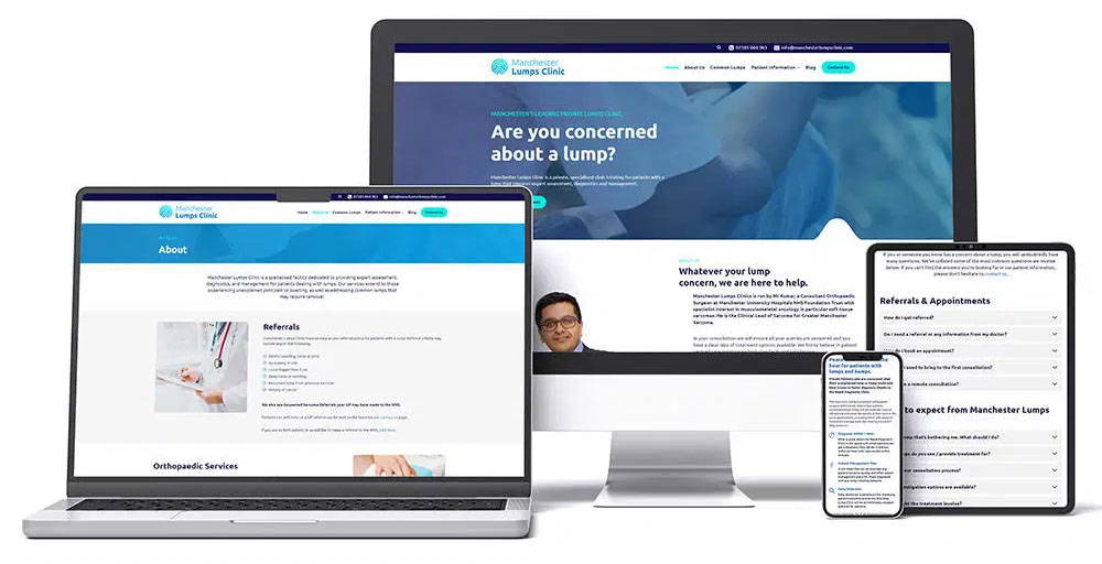
Built on WordPress, the new site restructures the entire patient journey around reassurance: